
The Linky brand,
in one place.
The logo, the sticker mark, the colours, the type and the way Linky talks. Use these when you write about Linky, link to it, or build something that works with it.
Logo
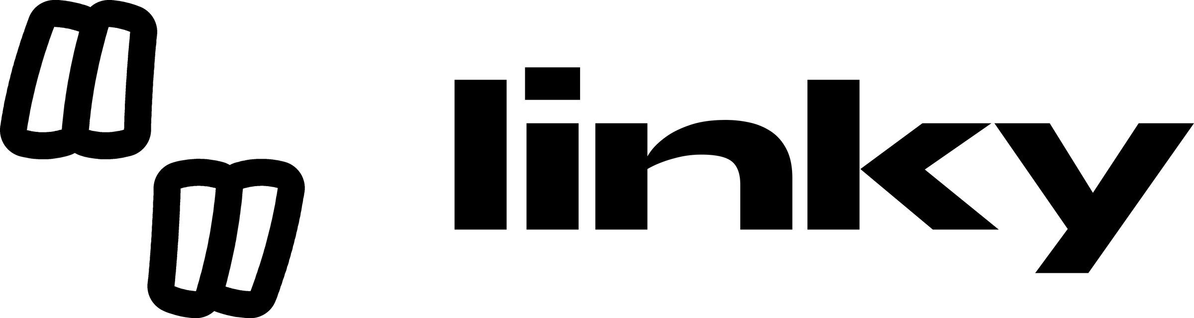
The logo is the sticker mark and the wordmark together. It is the default way to sign anything as Linky. Use the supplied files; never retype or redraw it.

Lockup
Mark on the left, wordmark on the right, centred on each other. The spacing is fixed in the files.
Mark alone
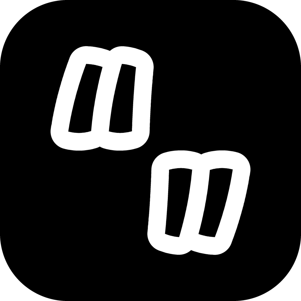
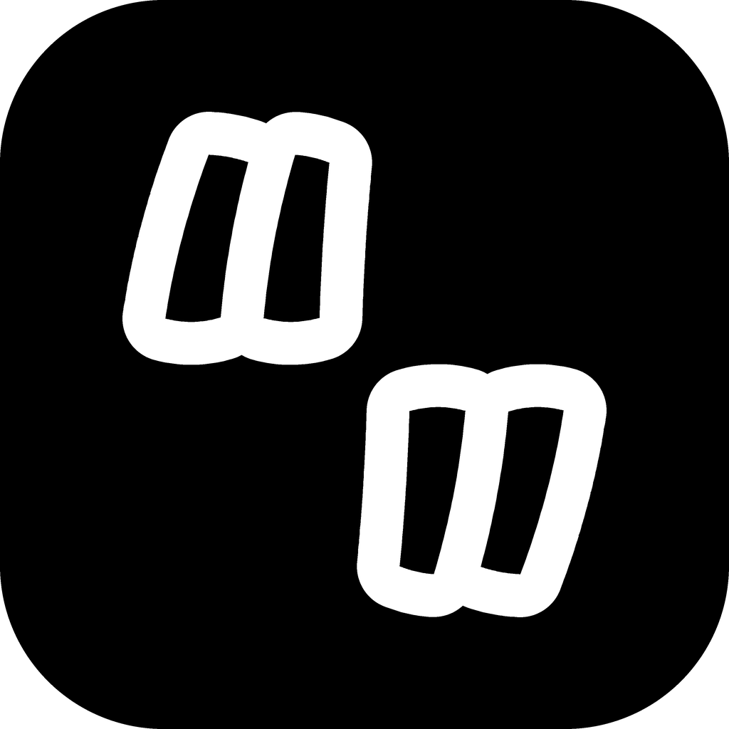
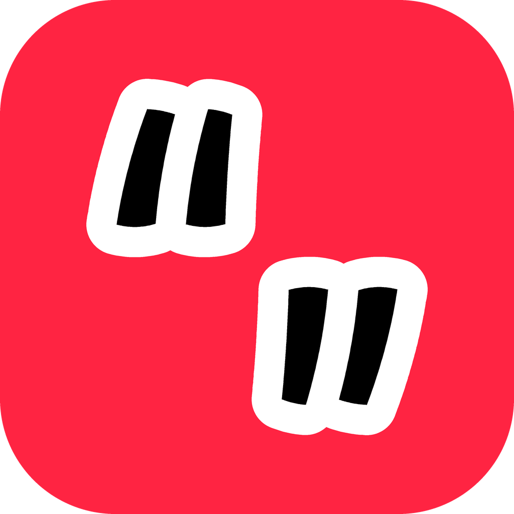
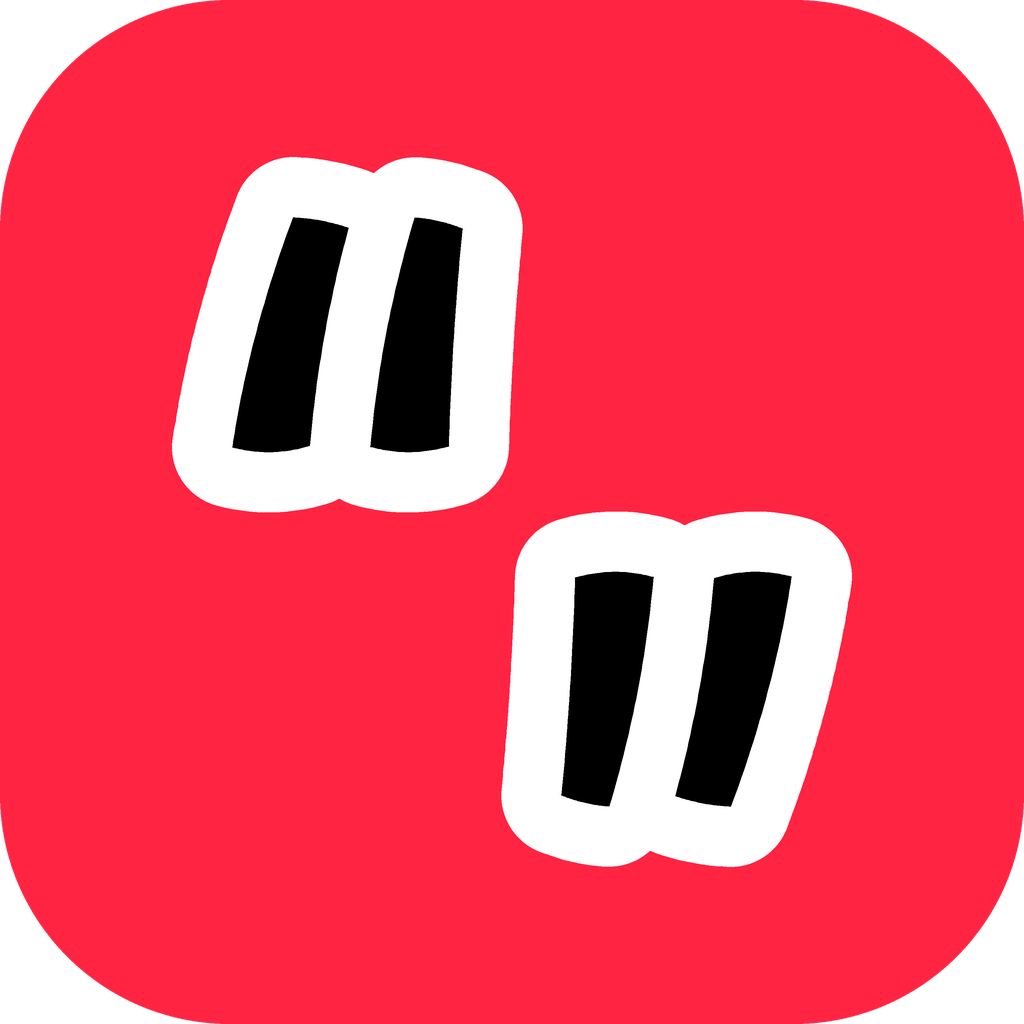
Where space is square or tiny: avatars, favicons, app icons, watermarks, stickers.
Wordmark alone
Only when the mark already appears nearby, such as a footer under an app icon.
The mark
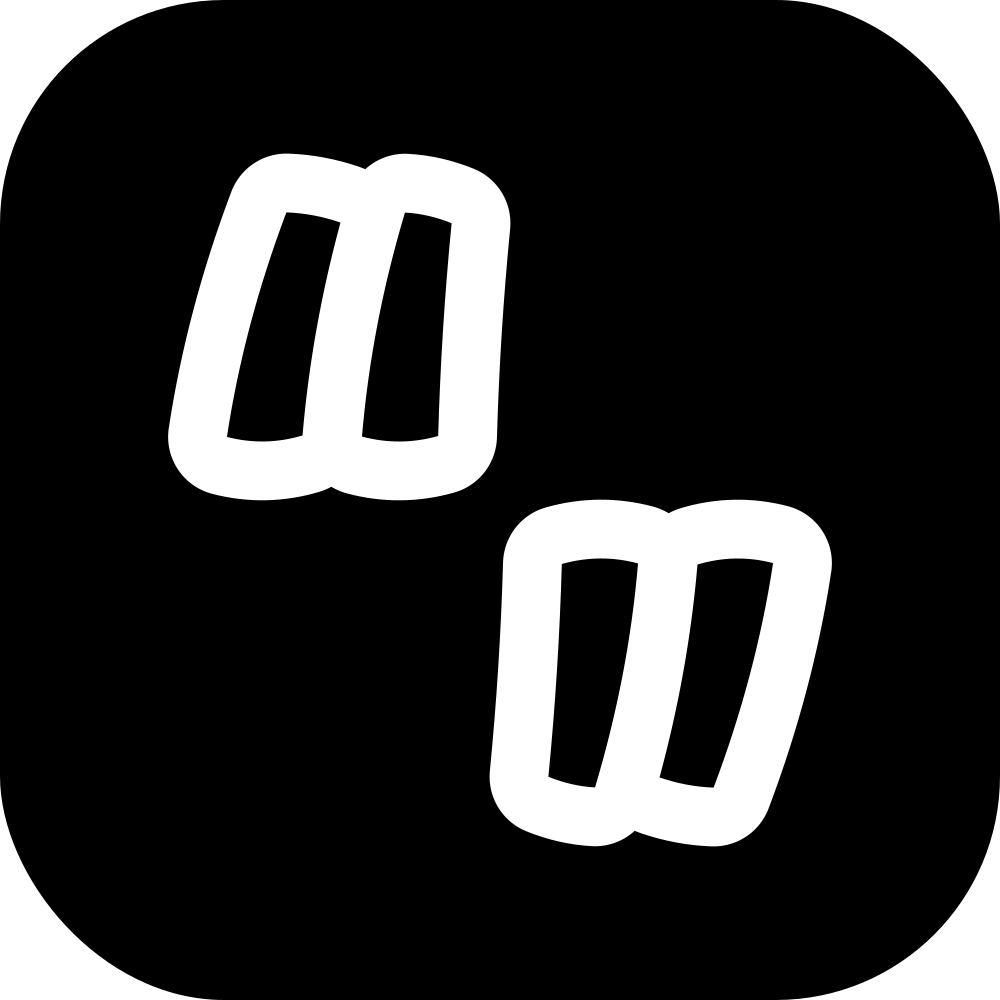
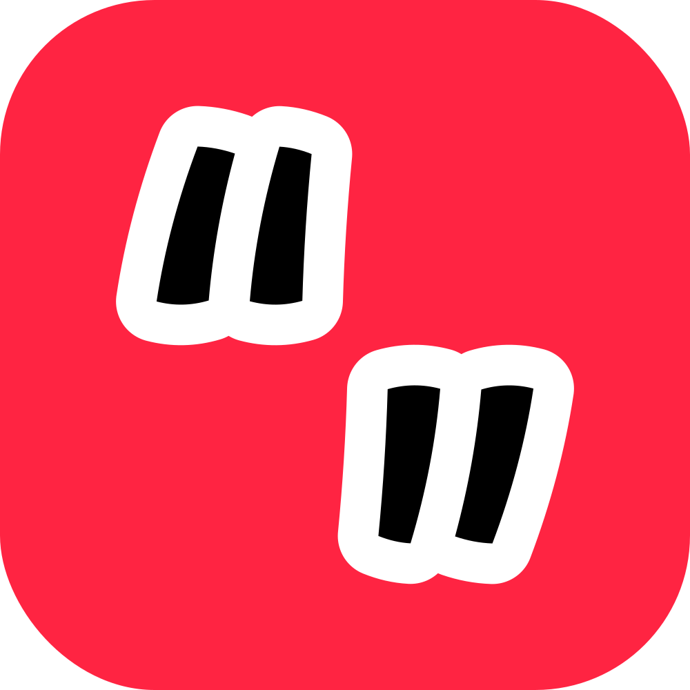
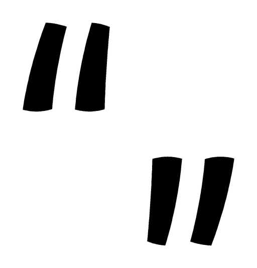
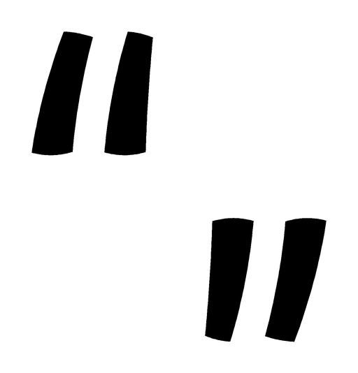
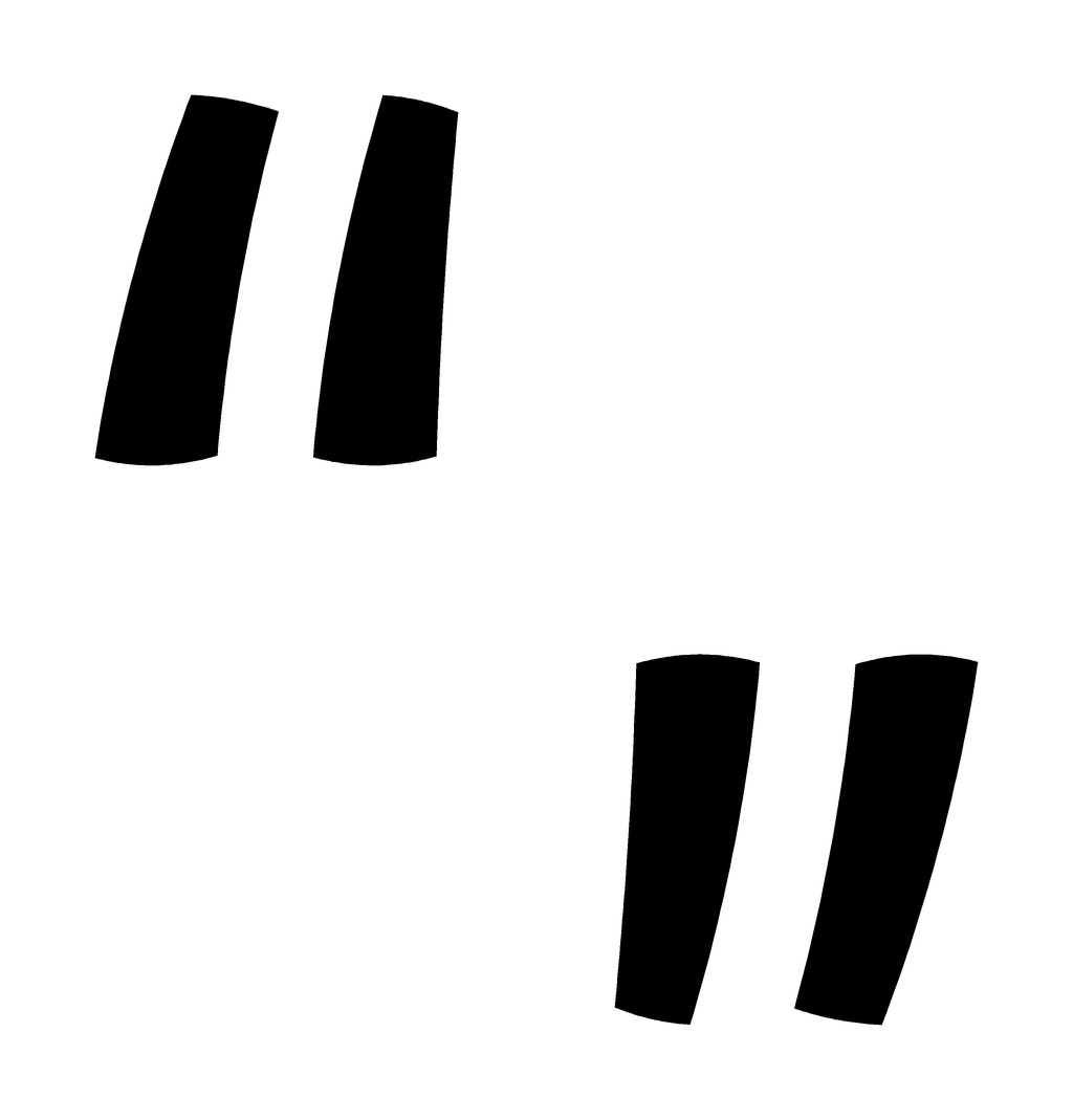
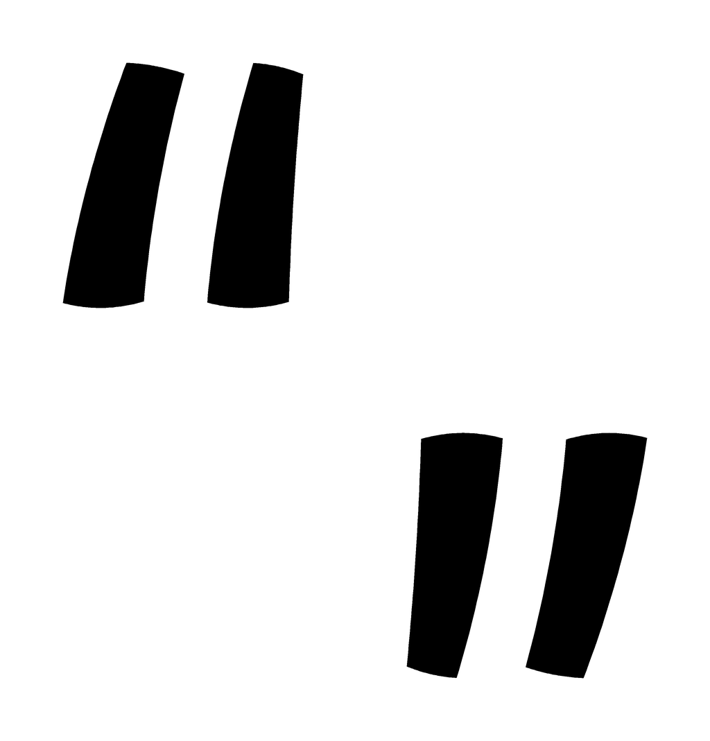
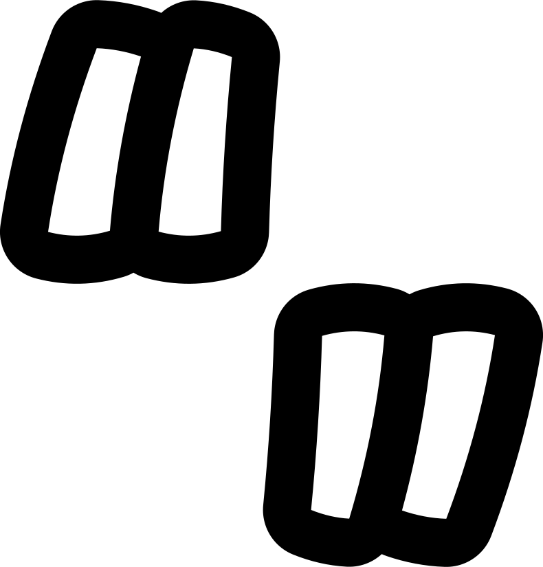
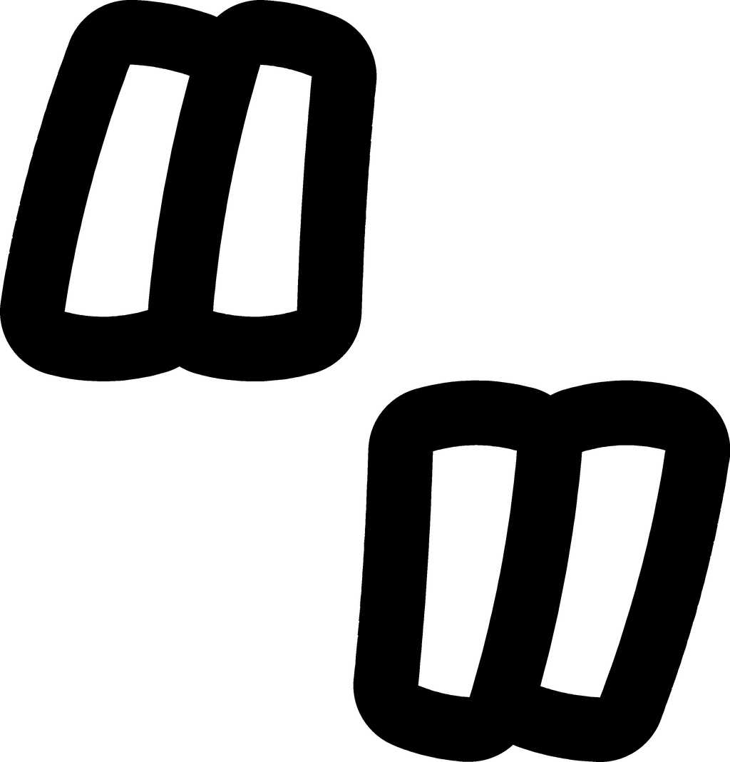
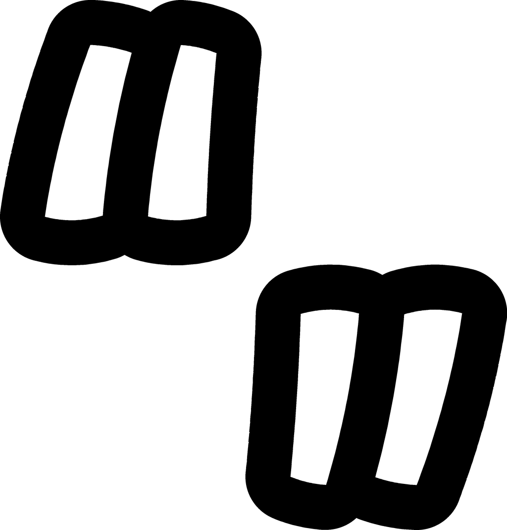
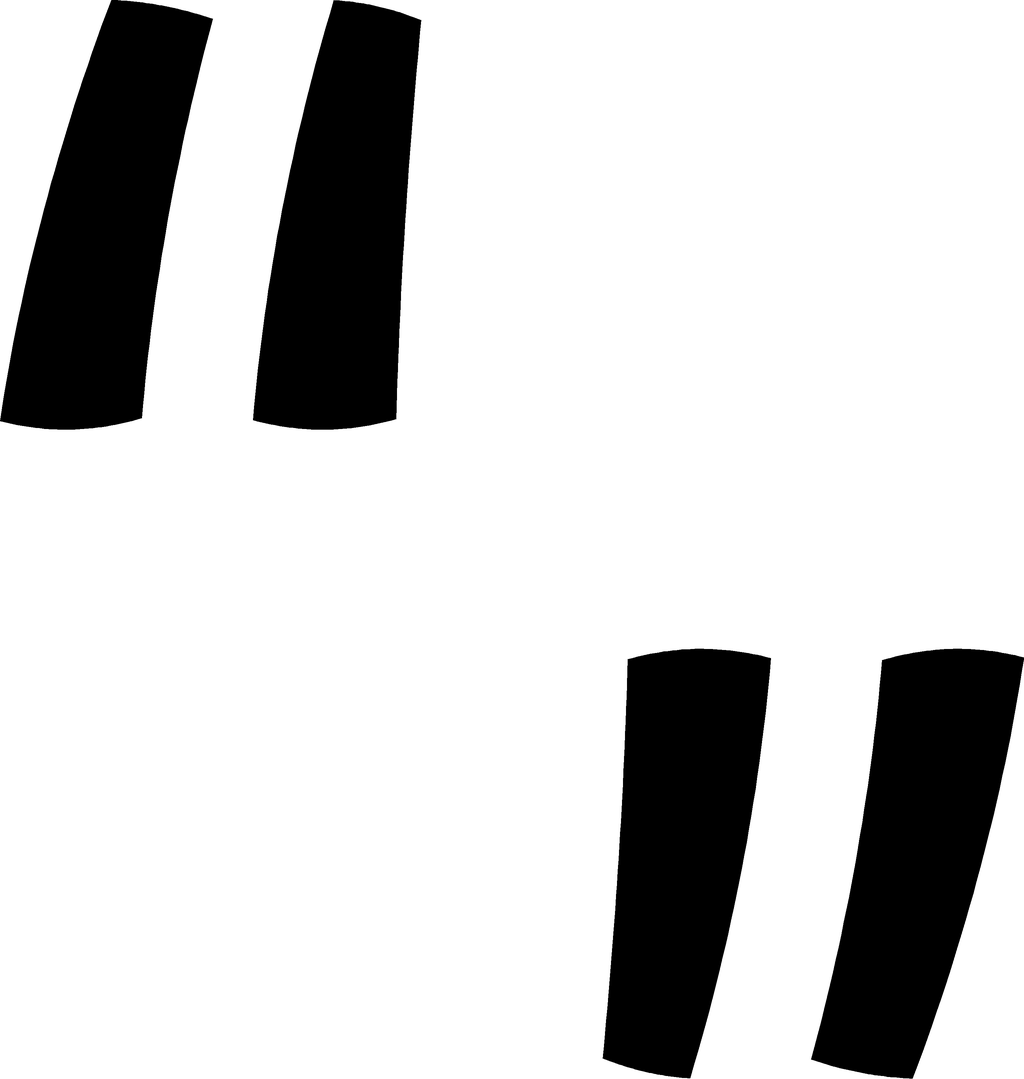
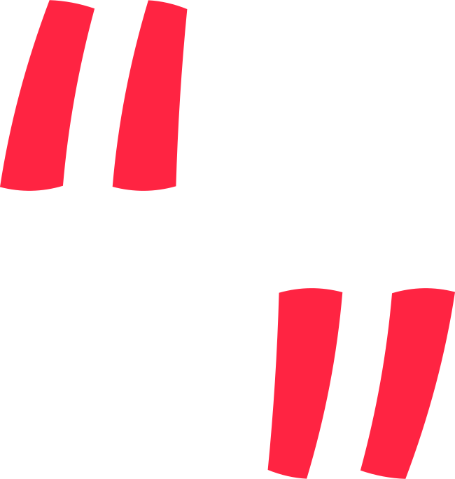
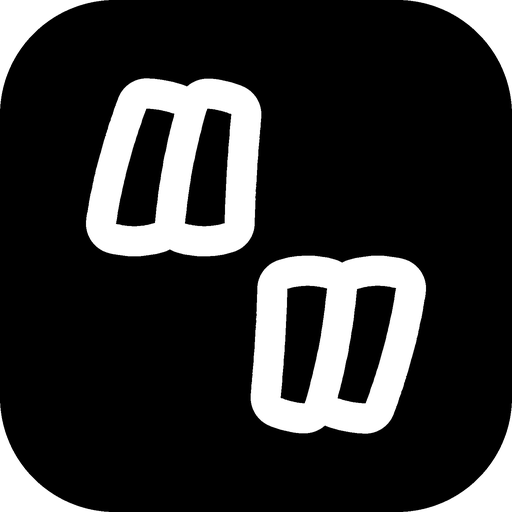
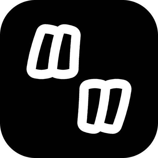
Two pairs of strokes, each cut out like a sticker. The lower pair is the upper pair turned 180°: two ends of the same link. The strokes lean and taper like quick handwriting, so the mark reads as made by a person, not a template.
- Symmetry
- Point-symmetric. The lower sticker is the upper one rotated 180° around the centre of the 1000-unit square.
- Strokes
- Four tapered strokes, wider at the foot. The upper pair leans right, the lower pair is the same strokes upside down.
- Sticker
- A round-cornered outline 70 units wide around each pair, about 8.5% of the mark’s height. It is part of the mark, not an effect.
- Colours
- White sticker and black strokes on dark and colour backgrounds; the inverse (black sticker, white strokes) on light ones.
- Flat version
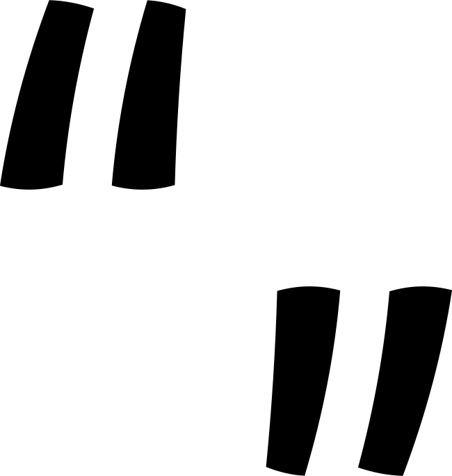
- Strokes only, one colour. For sizes under 24 px, embossing, embroidery and one-colour print.
Clear space and minimum size
Keep a margin of x around the logo, where x is the height of the lowercase n in the wordmark. Nothing else (text, edges, other logos) enters that area.
Logo: 80 px wide on screen, 22 mm in print. Smaller than that, use the mark.

Mark: 24 px with the sticker, 7 mm in print. At 16 px (favicons) switch to the flat mark.
Colour variants
Pick the version by the background, not by taste. Black is home; red is the loudest Linky gets.

Misuse
The logo only works if it always looks the same. These are the mistakes that come up most.
LinkyLINKYColour
Mostly black, a lot of white, a little red. Red means “this matters” (a button, a number, a highlight) and loses that meaning when it covers whole surfaces.
- HEX
- RGB
- CMYK
- 0 0 0 100
The canvas. Every Linky surface starts here.
- HEX
- RGB
- CMYK
- 9 9 0 96
Cards, panels and raised surfaces on black.
- HEX
- RGB
- CMYK
- 0 0 0 7
Primary text on dark, and the light background.
- HEX
- RGB
- CMYK
- 0 86 74 0
The accent. Calls to action, highlights, the glow.
- HEX
- RGB
- CMYK
- 0 58 90 0
Second accent, only next to red in gradients.
Neutrals
- MutedSecondary text, 8.2:1 on black
- DimTertiary text and captions, 4.4:1 on black
- LineHairlines and card edges
- Line strongInputs and ghost buttons
Aurora
The slow red and ember glow behind the site. Radial gradients of Linky Red, Ember and a pink (#FF3C78) over Black, always soft, never a hard linear stripe. It is a background, never a fill for text or the logo.
| Pair | Contrast | Use |
|---|---|---|
| AaPaper on Black | 17.9 : 1 | Body text, AAA |
| AaMuted on Black | 8.2 : 1 | Secondary text, AAA |
| AaRed on Black | 5.6 : 1 | Links, labels, numbers, AA |
| AaBlack on Red | 5.6 : 1 | Text on red buttons and badges, AA |
| AaWhite on Red | 3.8 : 1 | 18 px bold and larger only |
| AaRed on White | 3.8 : 1 | Large display text only, never body copy |
Typography
Four families, each with one job. All are open source and served from linky.moe, so nothing loads from a third party.
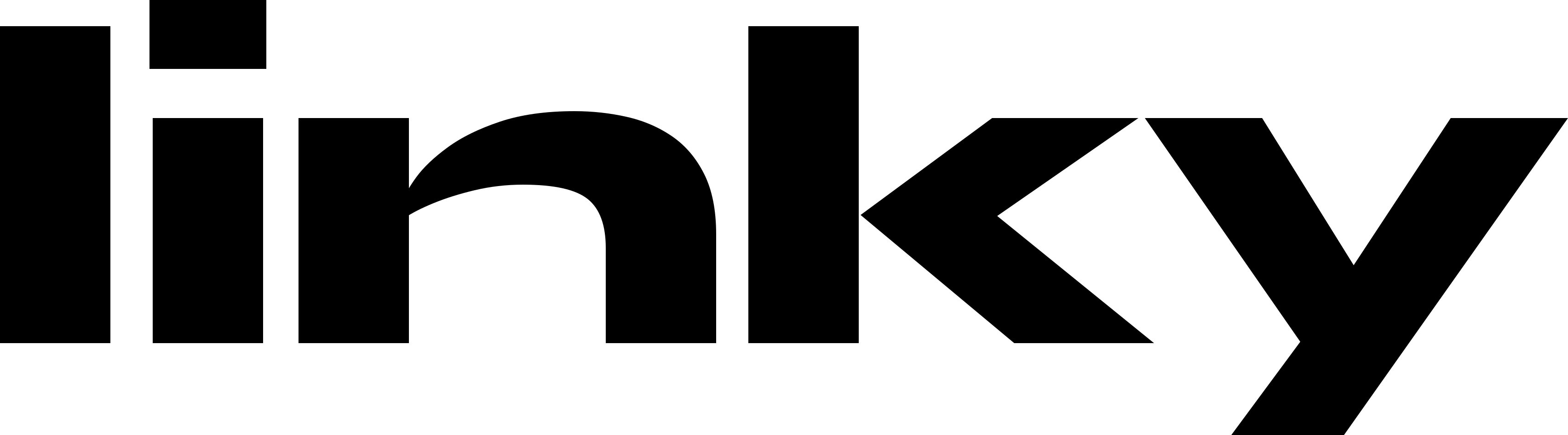
The wordmark is Syne ExtraBold at −3% tracking, then outlined. Do not set other text in Syne; it belongs to the logo.
Hero and page titles. Tight tracking (−3.5%), line height 1.0 to 1.1, short lines. One headline per view.
Section titles at 600, body at 400 with 1.6 to 1.7 line height. Everything a person reads for longer than a glance is Geist.
Eyebrows (11 px, uppercase, +10% tracking), handles, numbers, code, chips. Never for paragraphs.
| Role | Family | Size | Weight | Tracking |
|---|---|---|---|---|
| Display | Unbounded | 35 to 69 px | 700 | −3.5% |
| Section title | Geist | 32 to 58 px | 600 | −5% |
| Heading | Geist | 20 to 24 px | 600 | −3% |
| Body | Geist | 16 px | 400 | 0 |
| Small | Geist | 12.5 to 14 px | 400 to 500 | 0 |
| Eyebrow | Geist Mono | 11 px, caps | 500 | +10% |
Voice
Linky talks like the person who built it: plainly, specifically, and without selling. If a sentence would fit on any other product’s site, rewrite it.
Plain
Short words, short sentences, sentence case. No exclamation marks, no “unlock”, no “supercharge”.
Specific
Numbers and facts beat adjectives. “60 calls a minute” instead of “generous limits”.
Honest
Say what it does not do yet. Changes are announced in the changelog before they land.
Warm, not cute
Friendly and direct, the way you would explain it to a friend. Jokes are rare and never at the user’s expense.
Every feature is included for every account.
Views and clicks are counted without cookies. You see totals, never people.
Pick a name. It’s yours.
Unlock premium features and supercharge your brand!
We take your privacy very seriously.
The ultimate all-in-one link-in-bio solution 🚀
Naming
How to write the name and the address in text.
| Write | Not | Where |
|---|---|---|
| Linky | LINKY, linky, Linky.moe, LinkY | In sentences and titles. Capital L, the rest lowercase. |
| linky.moe | Linky.Moe, www.linky.moe | The address. Always lowercase, no www. |
| linky.moe/name | https://linky.moe/name/ | Profile addresses in print and captions. Full URLs in links only. |
| linky | typed out in any font | Lowercase belongs to the wordmark artwork and the small “made with linky” credit on profiles. |
| link-in-bio page | linktree, bio link, Linky page builder platform | The category. Hyphenated. Don’t use competitors’ names as nouns. |
In use
How the pieces come together in the places people meet Linky.
 made with linkyLinky · free link-in-bio pages
Everything you make.
Downloads
Vector SVG for anything that can take it. For pixels, WebP is the same image as the PNG at about a third of the size; use PNG where an app does not accept WebP. The kit has all of it plus a short readme.








Everything in one file
43 files: logos, marks, wordmarks and app icons in SVG, PNG and WebP, plus a readme with the colours and type.
The Linky name and logo are trademarks of Visiuun. You may use them to refer to Linky, link to it, or show that something works with it. Don’t use them in a way that suggests Linky made or endorses your product, and don’t use them in your own product name or logo. Press and partnership questions: [email protected].